Famous Movie Misquotes
posted by N James at 2:41 PM
![]()
This blog is open for comments from anyone in the IMLT program at Grant MacEwan College. Please feel free to comment on anything about the display that you liked, that you didn't like, things you think could have been improved upon, or things you felt worked well in the display. The assumption is that you have seen the displays in person, and are not relying on the sometimes bad photography to evaluate these displays! Thank you for any and all comments you may have.

5 Comments:
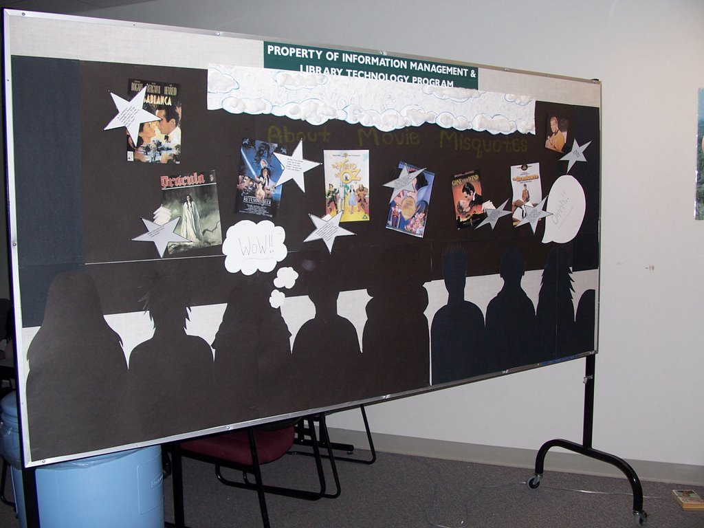
Neat idea but poorly executed. Once the heads of the audience were against the 'screen' they got lost. then the first thing to catch the eye is the white spaces.
The colour of the title words are too pale.
The font used in the quotes is too small. Maybe put less information, just what they DID say, not what they didn't.
I liked the fact that the stars were made so that they "popped out". The 3-dimension effect, as well as the white stars contrast against the black was eye-catching. Although, I feel that more colour contrast would have given the board more appeal. This could have been done by using more stars(maybe near the top of the board), or by giving the people a different colour. Currently the people become lost on the board and can be missed completely.
I like the movie theatre feel, but the head look like their cut off. I wonder if the misquotes could be bigger. I had to get really close to see the title, way too light.
Didn't like this one for many of the visual reasons already posted. Plus I couldn't really see the relevance for a library. Not only that, but several of the misquotes had such minor errors that they could barely be considered misquotes.
I have to agree that this is a nice idea but poorly executed. The colours of the fonts are hard to read, and how much material is there on misquotes that the library wants to increase circulation on.
Post a Comment
<< Home