Chinese Paintings
posted by N James at 2:38 PM
![]()
This blog is open for comments from anyone in the IMLT program at Grant MacEwan College. Please feel free to comment on anything about the display that you liked, that you didn't like, things you think could have been improved upon, or things you felt worked well in the display. The assumption is that you have seen the displays in person, and are not relying on the sometimes bad photography to evaluate these displays! Thank you for any and all comments you may have.

3 Comments:
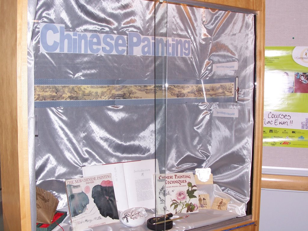
Lovely lush background fabric, unfortunately the title font colour fades into it.
Could have made more use of the sides (the little sayings are virtually invisible), and most of the display is at the bottom level.
I like the idea.
But it would have been nice to see more artwork in the background. Even working around the sides.
It looks lovely at first, especially with the brush at the center, but I had a hard time reading the title (the font is too light). And there is a lot of empty space here. There must be a lot more information on this art (its been around a long time).
Post a Comment
<< Home