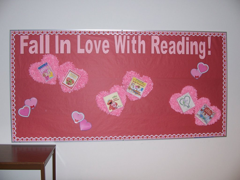
Fall in Love with Reading
posted by N James at 2:35 PM
![]()
This blog is open for comments from anyone in the IMLT program at Grant MacEwan College. Please feel free to comment on anything about the display that you liked, that you didn't like, things you think could have been improved upon, or things you felt worked well in the display. The assumption is that you have seen the displays in person, and are not relying on the sometimes bad photography to evaluate these displays! Thank you for any and all comments you may have.

4 Comments:
Nice use of the theme. Perhaps I would've have used more white or red as a contrast but that's a personal choice.
The font size is good, but it could've been lowered a little; it bumps into the border.
I found the placement of the books rather crooked. I had to use my neck a lot. There was also a bit too much blank space.
Otherwise it is a very neat and tidy board.
Has a happy feel and is not afraid of negative space. I think very effective for an elementary school.
Very enjoyable display, could use some contrast with the colour though. I really like the emphasis on the positive aspect of reading for fun. The title while a bit to close to the top says a lot.
Post a Comment
<< Home